I’ve been meaning to write a big post about what Firefly/Serenity means to me, but it’s going to take more time than I have right now, and I want to do it right. So this is not that post!
What it is, however, is a brief look into my first attempts at logo creation for a global event that means a lot to me by proxy: the annual Can’t Stop The Serenity charity screenings and fundraising events for Equality Now.
Since 2006, Browncoats have gotten together with Universal and Equality Now to hold screenings of Joss Whedon’s first feature film, Serenity, which are intended to raise money for Equality Now while letting us enjoy seeing our Big Damn Heroes on the big screen again – as well as bring new fans to the ‘Verse – all in celebration of Mr. Whedon’s birthday. The amount of funds and awareness that has been raised since we first began this endeavour has been astounding, and the events which continue to be held around the world almost seem to be growing in size, rather than dwindling, and that in itself is a major accomplishment.
I’ve attended screenings, and donated shiny items to be auctioned off at events, but this year, for the first time, I decided to get together with my Conjoined Twin (that’s another story – just trust me – it’s all related) and try to come up with a design or two that could be submitted to the annual art contest that the CSTS folks hold in search of their new logo for the upcoming year. I’ve been feeling like I want to contribute more fully lately, and putting together something with my girl would make the whole thing just about perfect. So, I put my brain to work and – while we came up with two pretty awesome designs – translating that into a format outside of my imagination proved to be somewhat difficult!
I have zero experience with graphic design software, or even advnaced photo editing software (like Photoshop – right over my head that goes), so outside of doodling something up in Paint, I was in over my head from the beginning. But I was determined to learn enough to at least get the basic ideas out there, and was mostly successful, I think. Mostly.
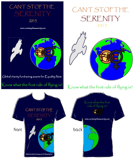
The first design is my favourite, but I could not for the life of me get it to look as awesome in real life as it does in my head. The basic idea was to have a view of Earth, with our wee Firefly-class ship floating in orbit above us, and the CSTS logo emblazoned across the globe. The selling point of this design is really the t-shirt, though, as I wanted the globe to stretch around the side, from front to back, and have the text, “Know what the first rule of flying is?” included across the back of the shirt. I got it looking as good as I could, but it’s still not really right. It is, however, Entry #2 in the logo art contest right now:
I was having so much trouble creating that design, that we decided to make a back-up plan, which was simpler and yet really kind of gorgeous. It’s the 8th annual event, so the number 8 is the centrepiece of a sort, with the CSTS logo dropped into the middle of the 8’s crossed lines. The green and yellow stripes were added to the dark blue of the Independents’ flag (we put the 8 in dark blue to take the place of the star that’s on the flag…or is it black? Crap, I always forget!), and the whole thing was dropped onto a brown background to added effect. As you can see, it’s simple yet elegant, much like our BDH’s (except Jayne, of course), and it is now Entry #7:
I can’t really express how honoured I would be if one of our designs were to become the event logo for 2013. It’d be a tiny place in Browncoat history that I would never forget – and not just because I’d have it on a t-shirt. This whole community is special to me for reasons I’ll explain in a better-written post, and if any of you feel so inclined as to help me achieve this tremendous honour, I really could never thank you enough. :’)
Voting can be done here until October 21, 2012 at 11:59pm PST, but you can only vote once, so make it count!
Thank you, stay shiny, and keep flyin’!


